
FUN ll Recycled Journal
In an age where digital tools are everywhere, choosing to design a paper journal is, in itself, a deliberate decision.
Not out of nostalgia, but because writing remains an irreplaceable sensory experience—the warmth of a cover held in the palm, the subtle resistance of a pen gliding across paper fibers, the quiet moment when ink is absorbed into the page. It is a rhythm where the body and the mind move together.
The FUN ll Recycled Journal began with a simple question:
If a journal is something people carry every day, could it be lighter, more comfortable, and closer to everyday life?
This project was not created merely to claim environmental responsibility. Rather, through the design process itself, the product naturally moved toward more environmentally conscious choices.
Service Content
Visual Design
Printing Production
Execution time:
5 month
Less Weight, Less Burden
At the core of the Recycled Journal is the idea of reducing burden.
Burden can come from weight, from ink that takes too long to dry, from overly decorative visuals, or from materials that place pressure on the environment.
For this reason, the design process began with subtraction.
By rethinking paper weight and cover structure, the overall weight of the journal was reduced by nearly 50%.
The final specifications—172g for 25K and 70g for 48K—allow the journal to truly function as an everyday companion rather than an extra weight inside a bag.
Lightness here is not about reducing quality, but about bringing the object closer to daily life.

The paper retains its natural fiber structure and avoids secondary surface processing. Ink is quickly absorbed without smudging or bleeding, allowing writing to remain smooth and natural.
The cover uses recyclable eco-friendly PU, reducing carbon emissions by more than 75% compared with conventional materials. Its texture has been carefully refined to maintain both flexibility and a warm tactile feel.
Together, these decisions form a quiet balance—
between user experience and environmental responsibility.

Visual Identity
The journal’s exterior is intentionally minimal.
A single color surface paired with an elastic band defines the visual focus, returning the object to a clear and simple geometric form. There are no graphic distractions or decorative elements competing for attention. The cover steps back, allowing the true protagonist to remain the user’s own writing and life.

Classic Series
The Classic Series is defined by low-saturation, calm tones with refined leather textures.
Colors such as black, white, gold, and deep blue create a soft and composed visual presence. Designed to accompany both work and daily life, the journals maintain a subtle elegance—quiet, stable, and enduring.
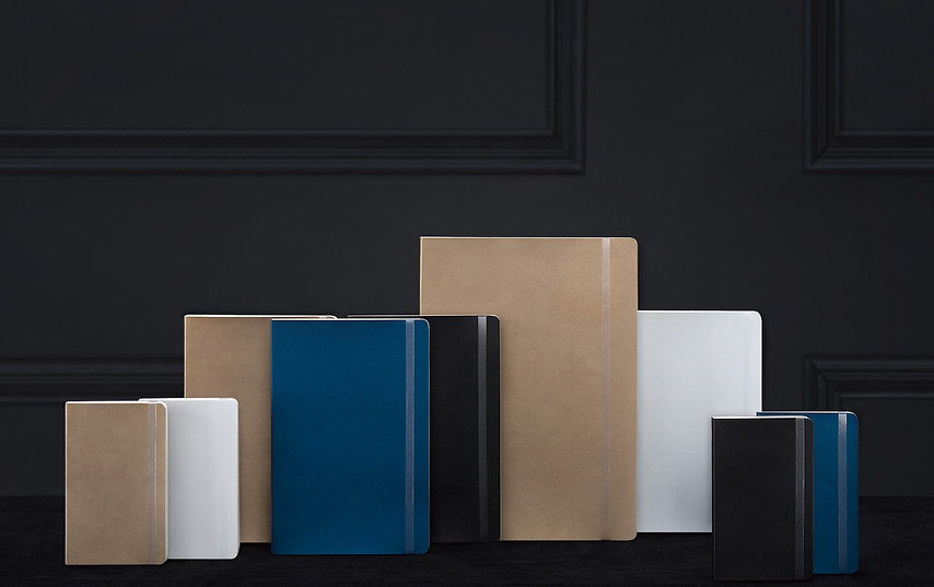

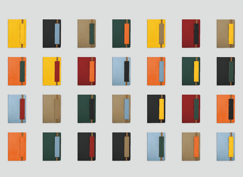
Color Series
Built on the same structural foundation, the Color Series introduces a more expressive palette.
High-saturation reds, oranges, greens, and vibrant tones bring personality to the object. The soft matte leather texture ensures that even bold colors retain warmth rather than feeling industrial or cold. In this series, color becomes a reflection of individuality.


Interior Design
Two interior formats are provided: a weekly planner layout and a lined notebook.
The weekly format introduces a gentle time structure that helps organize thoughts and daily rhythms. The lined version offers guidance for writing while maintaining generous breathing space.
Careful adjustments to line density and page margins ensure that writing feels open and unrestrained, allowing thoughts to flow without visual pressure.


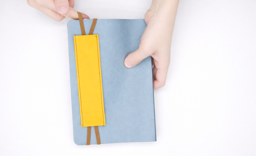
Recycled Pen Pouch
The recycled pen pouch extends the logic of the journal.
Writing rarely happens alone; a pen is always part of the experience. The dual-cord design allows the pouch to function simultaneously as a bookmark and as an elastic band that secures the journal—one cord marks the page, while the other holds the book together.
Rather than a simple accessory, the pen pouch becomes part of the overall structure.
Together, they create a complete writing system.
Open, write, close—each action flows naturally into the next.

FUN ll is the in-house designer brand of HaoWan.
Through design, we reawaken sensitivity to the everyday—transforming familiar objects into meaningful experiences once again.